Posters are central to the player’s experience in Night City, the dystopian setting of Cyberpunk 2077. I always believed they would be the most telling piece of the game’s world-building, the biggest indicator of the game’s underlying ideas. For better or for worse, I was right.
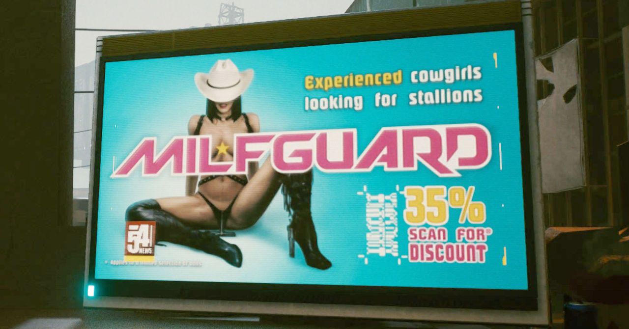
Even before the game launched, the posters were a key feature of the game’s marketing. In particular, one for the fictional energy drink Chromanticore, which features a feminine character with a huge, bulging crotch and the tagline “Mix it up.” The poster, and the toxic marketing campaign that developers CD Projekt Red built around it, have been discussed many times, including by myself. By examining Cyberpunk’s posters, we can begin to see the issues—not only with the game’s themes—but with the direction of the AAA scene over the past decade or so.
Related Stories IdeasCyberpunk 2077 and the Meaning of Its Deadly DildosHallie Lieberman
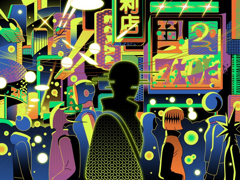 wake up samuraiOrientalism, Cyberpunk 2077, and Yellow Peril in Science FictionGeorge Yang
 go back to sleepYes, Cyberpunk 2077 Is Buggy. But Mostly, It Has No HeartAdrienne So
When we think of world-building in games, we tend to think of it on a more macro level. By this metric, there are some things Cyberpunk 2077 gets right—from the fantastic, entirely original soundtrack to the supporting characters like Panam Palmer. There’s also a lot it gets wrong, however, such as the mixed messages about the police’s role in perpetuating dystopia, endless movie references that undercut the game’s ability to tell stories, and most of the characters that aren’t closely linked to the narrative feeling underdeveloped and empty.
While it’s hit and miss at the big-picture ideas, the posters themselves are genius—but that might not be a good thing. I’ve counted close to 100 posters in Cyberpunk 2077, with several coming in different variants. If you choose any four at random, you’ll end up with a solid idea of what Night City is. The issue is that Night City isn’t particularly deep. It has different regions controlled by different gangs, but apart from the Badlands on the city limits—which features hardly any posters—the posters don’t differ thematically from one end to the other. CDPR made a lot of posters for this game, but it feels like it just chose 100 or so of its favorites and scattered them randomly across the city. While there are distinct geographic areas in-game (some places are near the coast, others the desert, others crowded cosmopolitan centers), the soul of every area in Night City feels remarkably similar.
Sign Up Today Sign up for our Games newsletter and never miss our latest gaming tips, reviews, and features.
As well as understanding Night City in an instant, there’s a high chance those posters chosen at random will contain explicit and exploitative imagery, many far more so than the “Mix it up” poster. They’re full of sex, violence, and often sexual violence. They contain racist imagery, dehumanising imagery, and shockingly gory imagery. Despite hyperconsumerism being Cyberpunk 101, there aren’t too many run-of-the-mill “Buy some new sneakers!” posters. Everything is dialed up to 11. If they’re telling you to buy something, it’s usually something sexual, something violent, or they’re selling it to you through sex and violence.
Cyberpunk’s posters, according to Piers Robinson, codirector of the UK-based Organisation for Propaganda Studies, can be understood as “surface level.”
“They construct the feel of the game with its focus on a dystopian world dominated by, in its own words, ‘power, glamour, and body modification,’” Robinson said. “Whatever one’s moral stance regarding the images, which to some will be shocking and provocative but not to others, they presumably work well in terms of creating an appropriate visual backdrop for the fantasy game.”